| Here comes another step in the conception on project “Jarvis”. For once, let’s not be too geeky. I feel artsy today. I’ll focus on the GUI and fire up Inskcape et the Gimp. Yeah, still a bit geeky, I know… |  |
Jarvis-like GUI
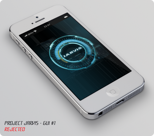
Let’s try the first idea take comes to my mind: create an interface … just like Marvel’s Jarvis. I googled a bit, watched a couple of scenes from the movies and came up with a first rendering:

And it sucks :poop: !
Yes, Jarvis on the movies looks badass. But as a GUI, no matter how hard I tried, there no way it can be usefull to anything at all.
Siri-like GUI
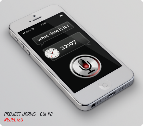
The second idea would be a Siri-like interface. Just like I drew in the first scketches. Here’s a first rendering:

And … that sucks too :poop: ! It is a just a boring copy of Apple’s SIRI :yawn: …
Plus, I want something dead simple, and that would provides natural ways to navigate between Wolfram|Alpha’s pods.
Haze-like GUI
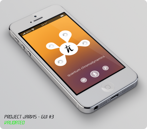
Haze is a fantastic weather forcecast app for iOS, with a very unique interface. Almost peotic. That’s definitly what I want for project Jarvis 🙂 !
Here’s a sketch of what I have in mind:

I feel, the GUI should be as minimalistic and intuitive as possible:
- A simple button to trigger voice acquisition
- A smaller button to rise a keyboard and enter a query
- A third button to share the results
- On top of these buttons, the textual reformulation of the query
- At the center, Jarvis’ answer to the query
- Around the main bubble, various pods from Wolfram|Alpha
I like that :silly: !
And I guess, that’ll be all for this week-end !